 - 1 2 3 4 5 6
- RINNAI HOME HEATING CATALOGUE 2012
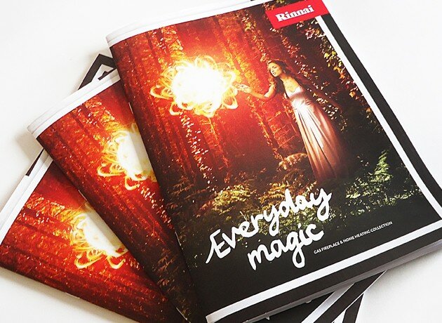
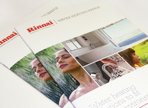
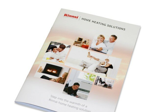
- The fresh new brand positioning for Rinnai has been launched! Everyday Magic comes with a suite of new photography, bespoke fonts and consumer driven elements to build brand awareness across a range of their product categories. First in line is the home heating catalogue which is now in-store nationwide. Look out for the media campaign that supports all the below the line collateral that is underway.
|
 - 1 2 3 4 5 6
- Me Magazine
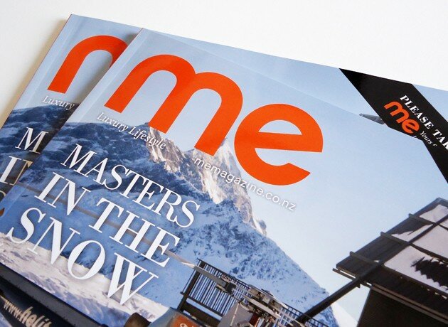
- The design refresh for Me Magazine is now complete and available nationwide! This lifestyle publication is bi-monthly and showcases a range of interesting articles to feast your eyes upon! The new look was created to modernise and give breathing space to each page layout achieving a consistent flow and design system.
|
 - 1 2 3 4
- HR Connect
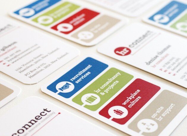
- We undertook a brand refresh for this very successful HR consultancy in Hamilton. Evolving their identity and applying a fresh new look and feel across key marketing material, corporate stationery, website and photography shoot. Our aim was to create a unique tone and manner that gives HR connect a point of difference and represents how they work with their clients; professional, personable and on the ground making things happen.
|
 - 1 2 3 4
- Greerton Health
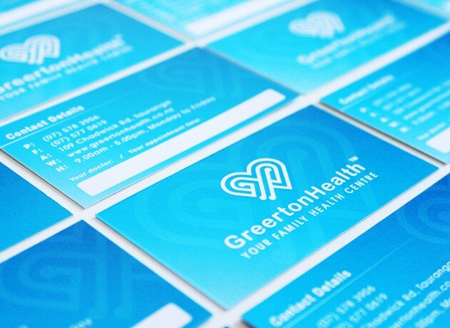
- Re-brand for a local medical centre, helping them create a point of difference through a look and feel that is unique to their practice and represents who they are. Cultural cues are woven throughout the fresh and vibrant identity, representing the client's values and the experience they offer their patients. The visual toolkit we created was translated across external signage, corporate stationery, brochures and a dynamic new website.
|
 - 1 2 3 4
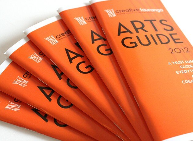
- Creative Tauranga Arts guide
- The 2012 Arts Guide is out now and is a great way to discover everything there is to know about the creative culture we have right here in Tauranga. Showcasing a range of artists, galleries and places of creative interest that our region has to offer. We redesigned and structured the guide to give it a fresh new approach to be enjoyed by locals and visitors to the Bay.
|
 - 1 2 3 4
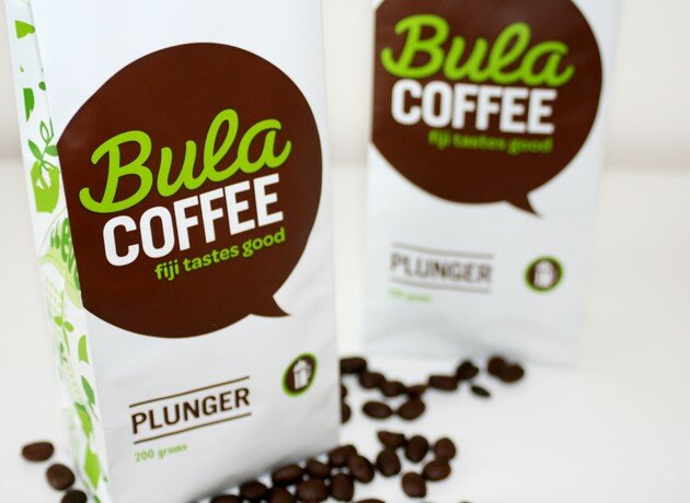
- Bula Coffee
- We were approached by a non-for-profit organisation that is helping the villages of Fiji to produce and package their coffee for sale. Targeted at the tourism market in Fiji, our brief was to come up with the complete package. Brand name and story, positioning, point of difference, unique look and feel, cultural cues and personality. Our concept "Bula Coffee" came to life with the idea that a real coffee drinker loves their daily brew so much they could almost speak to it!
|
 - 1 2 3 4
- Think Technology
- We embarked on a complete branding process for Think Technology who develops IT corporate software across a range of sectors. Our tasks involved strategy and positioning, brand identity development and the creation of an accompanying visual toolkit that uses vibrant colour and patterns to give a sense of dimension to reflect their innovative business. This resulted in a fresh look and feel that was translated across corporate stationery and collateral, brochures and website.
|
 - 1 2 3 4
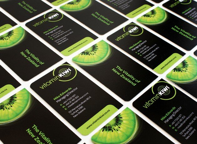
- Vitaminkiwi Kiwifruit capsules
- Now here is an exciting new product! Vitaminkiwi Kiwifruit capsules are 100% natural made from a unique whole-fruit kiwifruit extract that includes the skin of the kiwifruit, where much of kiwifruits powerful antioxidants reside. Kiwifruit is one of the healthiest fruits around and this product is sourced only from the Bay of Plenty. Our task was to create a brand identity, packaging design and marketing material that strategically appeals to the tourism market. The chosen brand colours and imagery ensure clear differentiation from other vitamin brands with messaging that reinforces why this product is world-first. Enjoy the vitality of NZ everyday with just one capsule which contains the same amount of antioxidants, enzymes and fibre as is found in one New Zealand Green Kiwifruit, including the skin.
|
 - 1 2 3 4 5 6
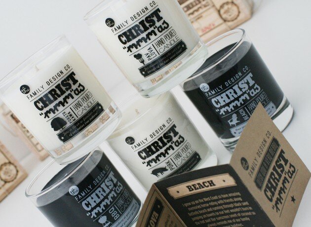
- Family Christmas 2011
- We look forward to our annual tradition where we create gifts for our clients that are just that little bit special. The team at Family decided this year was all about celebrating the familiar smells and taste of things that make us go "mmm" it's Christmas time. We all came up with a scent that we love most to create five hand-poured candles, each with their own personalized smell and story. These limited edition candles come in a printed glass canister with alternating black or white wax. Packaged in a wooden box, stamped, signed and sealed by each of us to wish clients a very merry Christ "mmm" as.
|
 - 1 2 3 4 5
- Mossop's Honey
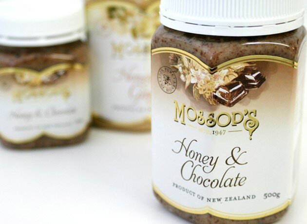
- Mossop's honey is a family owned business that was established over 60 years ago. When we embarked on the refresh of their brand identity and packaging redesign we needed to strategically ensure that we retained the important elements of equity that have built up over time. Their point of difference is not only in the quality of the honey they produce and trusted heritage but also their jar shape and golden cues that loyal customers now recognize in New Zealand and around the world. Our evolution was a subtle re-balance of their identity and new typeface along with introducing a fresh feel with the use of white to stand out from competitors. We painted water colour style illustrations for each variant giving the flowers a retro style that harks back to the era when Mossop's honey was first made. Printed on a matt stock with gold foil reflects quality and highlights the unique label shape they have come to own in the category.
|
 - 1 2 3 4 5
- Rinnai water heating catalogue 2011
- We've been working closely with Rinnai on the evolution of their brand which is an exercise that has taken them in a new and exciting direction. Our objective was to weave through fresh design elements that bring an emotive NZ feel by use of engaging imagery and key brand messages to connect with the consumer. Educating them on the range of water heating products that Rinnai produce and navigation of the catalogue was key. Starting with our proposed pagination and flow of content, to concept layouts of key spreads, designing contrast feature pages through to product illustration and final delivery of artwork. This comprehensive sales tool is now available in a variety of retail outlets nationwide.
|
 - 1 2 3 4 5 6 7 8 9
- Candles of New Zealand
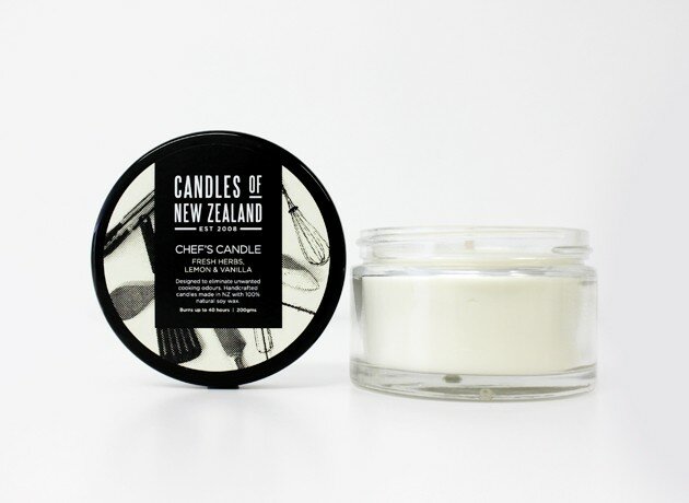
- We're pleased to announce that Candles of NZ have just launched their new brand and packaging designs in time for this year's Auckland gift fair. Family refreshed their overall brand strategy and positioning, along with establishing how their large range of products can be segmented, clearly differentiated, whilst achieving consistency under the parent brand. Our challenge was to create a new identity that works strongly across varying formats and sizes; jars, tins, wraps and labels - always being the most prominent and reflecting the premium qualities of their hand-crafted candles. Each range is treated differently through the use of typography, illustration, pattern, photography and colour. The result is a solution that allows for easy expansion into new products and guidelines to keep future designs fresh, clean, simple and modern.
|
 - 1 2 3 4 5
- Target Australia - Point of Sale
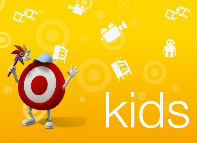
- We've created a complete point of sale and way-finding solution for the Roselands Target store in Sydney. It has revolutionised the way consumers engage and navigate their way through the different genres within their entire entertainment category. These days consumers are faced with an overwhelming choice and that's why branded environments, point of sale and ambient media all play a crucial role in influencing buyer decisions. We've just received sign-off from Target to roll out our POS concept nationwide across 160 stores within Australia.
|
 - 1 2 3 4 5 6 7
- Bluelab - New product development
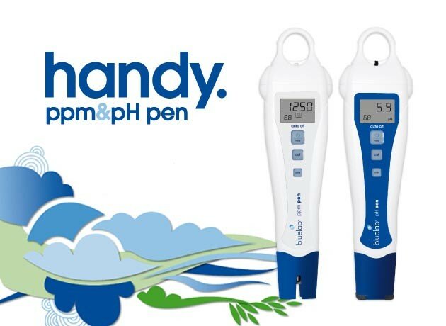
- Bluelab has expanded their product range with the development of the new handy-sized pH and ppm pens! Targeted at the entry-level grower, we strategically positioned the pens to be more relaxed and fun to stand out from their more technically advanced commercial products. We achieved this through our design look and feel, treatment of funky illustration and copywriting that is easy for consumers to engage with and understand how to use the devices. The rollout consisted of packaging, POS posters, brochures, tradeshow banners, press advertising and t-shirts to launch and promote across their overseas markets.
|
 - 1 2
- Bella Vi - Design refresh
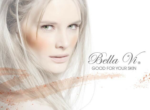
- We're thrilled to be working with local mineral makeup brand Bella Vi to refresh their brand positioning which has just been launched with a new advertising campaign, corporate literature, exhibition signage and website. We developed a tone and manner that reflects the values of Bella Vi and their pure and natural ingredients, changing the strapline to 'good for your skin' and focusing on the health and beauty benefits of using their range of products. We also created an on-air competition and live-streaming product placement on More FM Auckland's More in Store segment.
|
 - 1 2 3
- Rinnai - Winter advertising campaign
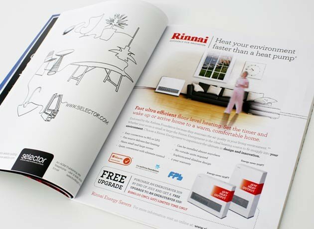
- Our winter advertising campaign for Rinnai is targeted at consumers who are looking to upgrade or replace their home heating source. Heat pumps have saturated the market and a lot of people are not aware of the benefits of using gas as a utility. The Rinnai energy savers and gas fireplaces are efficient, have high heat output and look great in your living space. There is nothing like sitting around a fire and the ambience it adds to your home on those cold winter nights!
|
 - 1 2 3 4 5 6
- Rinnai - Nationwide POS solution
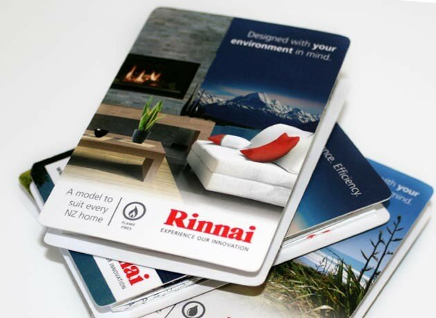
- Rinnai NZ wanted innovative and informative POS material to effectively communicate the features and benefits of their extensive range of hot water systems and gas fireplaces. We designed these guides as an engaging, easy to read, handy-sized brochure that can be used as a sales reference for trade and to better understand the Rinnai products, specifications and accessories available. They are displayed on countertops in a custom designed box throughout Rinnai New Zealand stockists nationwide.
|
 - 1 2 3 4 5 6 7
- BOP Export Awards 2011
- We are thrilled to be the creative agency for The BNZ Partners BOP Export Awards for the third year running. We thoroughly enjoy showing our support for the local exporting community; being close to our hearts with the many clients we work with to build brand and marketing strategies for their overseas markets. This years theme "The Orient Express" gave us so much creative scope and we had a lot of fun creating the brand, design look and feel, invitations, tickets, programmes, advertising and awards (along with finding outfits to all go as french glamour for the Family table). Congratulations to all the nominees and winners; we wish you all the best for the rest of 2011!
|
Rinnai NEO Commercial
The NEO is the latest gas fireplace from Rinnai due for release this coming winter. From storyboarding key messages and flow of content, to filming, animation and production; we have delivered a sales tool to communicate with both consumers and trade. Integrating the campaign with direct mail initiatives, in-store POS material, press advertising and sales collateral.
|
Rinnai Infinity VT Commercial
For the launch of the all-new Infinity VT hot water system, we wrote, directed and produced this digital commercial. Showcasing the features and benefits of this product range in an engaging format that reflects the innovation of Rinnai as a brand. It will be used across multiple channels in-store, events, trade shows, showroom, seminars, and online.
|
 - 1 2 3 4 5 6 7 8
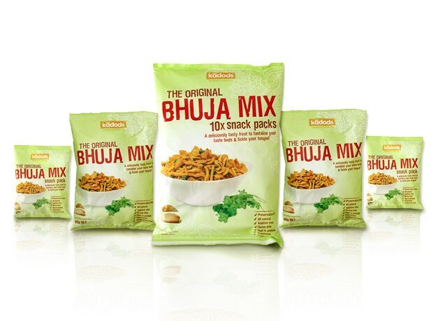
- The Original Bhuja Mix
- Identifying a gap in the market for a healthier alternative to other snack foods "The Original Bhuja Mix" has just been launched into the foodstuffs distribution channel, other gourmet supermarkets and specialty retailers. This authentic family recipe originated in the Indian village of Kadod and has been made the old-fashioned way in Fiji for many years. Our first task was to develop a marketing plan and to position this unique product offering effectively for the NZ market by undertaking comprehensive market and consumer research, visual auditing, competitor and category analysis. From there we uncovered the history that enabled us to create a compelling brand name, identity and story to build on product differentiation and credibility. The packaging design reflects these heritage cues in a modern way with the use of fresh product photography, ingredient cameos and cultural patterns.
|
 - 1 2 3 4
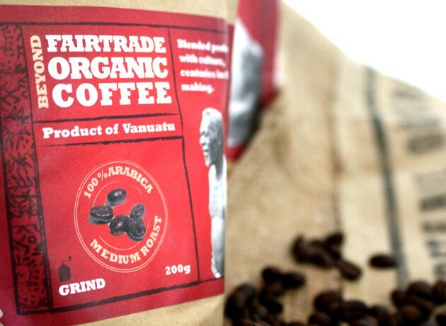
- Yasur Mountain Organic Coffee
- Yasur Mountain organic coffee represents the hard work and lives of the people of Tanna Island, Vanuatu. When designing the brand and packaging we weaved through unique cultural elements that have significant meaning to its origin, and pay homage to the chief of the village. The craft substrate gives a feel of authenticity with a foil inner to keep the beans fresh. The bespoke label is over-layed to create a boutique style and finish. Profits from the sale of this coffee are returned directly to the people of Tanna and made available for the brighter future.
|
 - 1 2 3 4 5 6
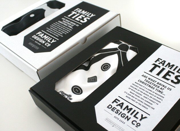
- Family Christmas Gift 2010
- Being the first Christmas gift as Family Design Co. we wanted to reinforce the message behind our new brand and give clients something they would be proud to wear. The idea "Family Ties" was born as we believe that is what brings us all together at Christmas time. Creating four different designs for ladies and men, alternating them between black and white t-shirts. Packaged in a black or white box with die-cut window to reveal only the tie design. Wrap-around label introducing "Family Ties" along with ribbon and card attached to each shirt. *Thanks to Lower for sourcing and printing t-shirts*
|
 - 1 2 3
- City Centre Campaign
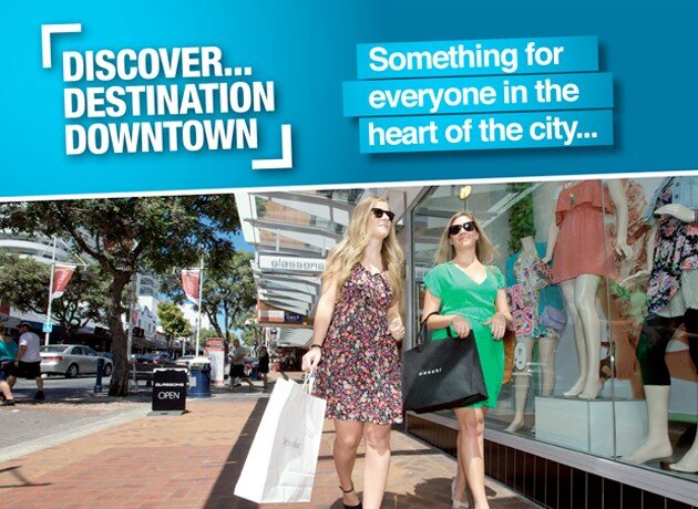
- Our brief was to create a compelling advertising campaign to drive awareness for all the things you can do and see in Downtown Tauranga. The idea and strong call-to-action "Discover Destination Downtown" connects visually through the use of engaging local photography and highlights the key points of difference the city has to offer over any other location. Whether it be shopping, dining, entertainment, family or business - there is something for everyone day or night.
|
 - 1 2 3 4 5 6 7 8 9 10 11 12
- Community Projects
- Cycle Tauranga Bike Hire & Tours Historic Heritage Walk Sights of the City Tour Art Fair 2011 The Cargo Shed The Freight Room. It has been great to work on some local community projects with Tourism BOP, TCC, Creative Tauranga and Mainstreet. Adding a touch of vibrancy, colour and appeal to the brand and marketing material used to promote these exciting tours, locations and events happening in our city centre.
|
 - 1 2 3 4 5 6
- Geeper's Keepers
- This amazing product has been launched to market offering users of crutches a way of keeping them together and right where they need them! We created a brand to reflect the personality and passion of 12 year old Georgia who invented a product that is now being used in hospitals and can be ordered online. Telling her compelling story through a cartoon strip and illustration used in marketing material and website. To see how they work check out our demonstration video at www.geeperskeepers.co.nz
|
 - 1 2 3 4
- Cubed3
- Cubed 3 is a gear design company based in Auckland exporting their innovative products to the US and Europe. We created an identity to reflect this technology led business along with marketing literature, company communications and website. Defining their target markets with an online strategy to separate their business into two core offerings: marine and industrial.
|
 - 1 2 3
- Claymark
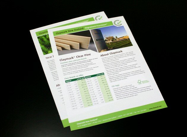
- Claymark NZ export their premium milled and manufactured pine products to the world. Currently expanding into the UK market, we created product and sales material for their target audience and to highlight key product benefits. We most recently redesigning the website to give customers a better understanding of their product ranges, specifications and to clearly differentiate between offerings within their overseas markets.
|
 - 1 2 3 4 5
- Rejuv Skin and Laser Clinic
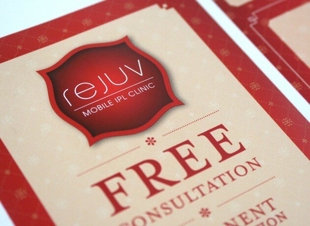
- Rejuv is a boutique clinic that offers a truly unique experience for their clientele. Our aim was to create a brand that is quite different from what you would expect in the beauty business. The idea - to communicate varying treatments through "victorian beauty" and steer away from photography commonly used in the industry. We translated this classic look and feel across marketing material, newsletters, treatments cards, promotional items, website and in-store.
|
 - 1 2 3 4
- Export BOP
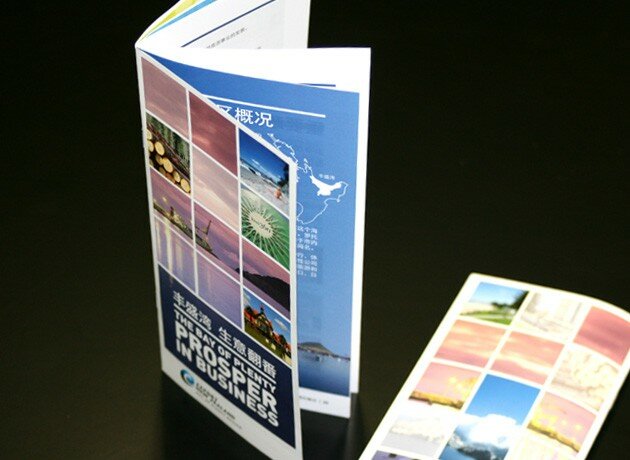
- Hot off the printing press and on its way to China are a few thousand brochures that will be used to engage with prospective Chinese businesses at the Shanghai World Expo. The brochure encompasses all that our region has to offer with quotes from key delegates and a range of local businesses showcasing their products. We created the concept "Prosper in Business" as prosper has a profound meaning in Chinese culture along with the connection and history to our Bay of Prosperity. The idea is to resonate and inspire the formation of successful trading partnerships with the Bay of Plenty.
|
 - 1 2 3 4 5
- Family Design Co.
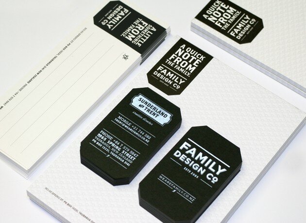
- Continuing on with our understated look and feel we have translated the Family brand across stationery and office materials. Expressing our personal nature by creating notepads, address labels and envelopes made from quality offset stock. Business cards have been specially crafted using hefty black card over-printed with white to achieve an old-world result that feels tactile and communicates our uniqueness.
|
 - 1 2 3
- Export NZ BOP
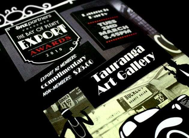
- We are proud to be a key sponsor of Export New Zealand Bay of Plenty and work closely with them to support local exporting forums and the development of our economic growth. We work alongside export-focused businesses and add value to their overseas marketing strategies with our knowledge and understanding of global markets. For the past few years we have created the concept for our local awards evening and translated this theme across event branding, invitations, tickets, press and awards.
|
 - 1 2 3 4 5 6
- Downtown Tauranga
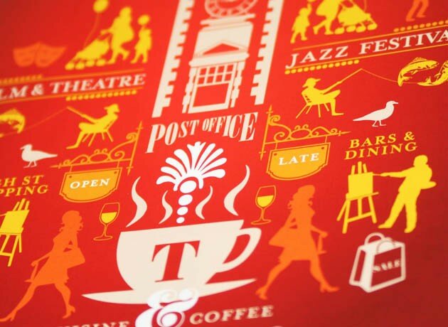
- Working with Mainstreet Tauranga as their strategic marketing partners, we firstly rebranded Downtown Tauranga to lift the perception with key audiences being; local residents and visitors to the region. We created an ownable look and feel that would not only build their brand recognition but also inject some life and personality to reflect this thriving destination and what it has to offer. To launch this new brand and sophisticated image we did a mail drop to 40,000 households in central Tauranga. We developed a concept built upon experience your city centre which is about re-engaging with local residents and making them aware of the variety of things to do and see in their city. We continue to work on new initiatives to drive people and business into our central city.
|
 - 1 2 3 4
- Creative Tauranga
- We love working on projects that support our local community and partnering with Creative Tauranga fits well with what we like to do everyday
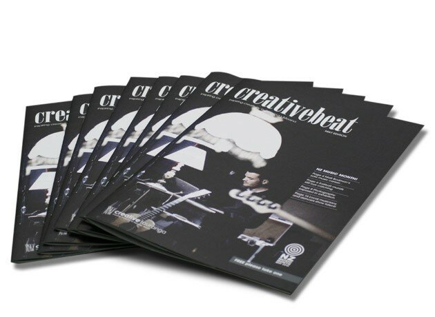
being creative! Creativebeat magazine has a strong following of people who are passionate about arts and culture in the BOP region. With a carefully considered redesign we could see a fantastic opportunity to lift the image of the overall publication, as well as complementing the amazing creativity and talent that is showcased each month. We developed a sophisticated look with new masthead, cover design and colour palette, flow of content and treatment of sections, typography, imagery and illustration. Our aim is to not only appeal to a wider audience and grow readership but also to raise awareness of Creativebeat to make it bigger and better than it is today.
|
 - 1 2 3 4 5 6 7
- Annandale
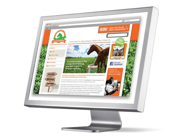
- Located in Taupo, Annandale is a leading supplier of quality stock food throughout New Zealand. Working closely with them for the past 3 years, we have realigned their brand positioning, developed a fresh logo, redesigned their packaging range and new product development, implemented direct mail initiatives, copywrote and designed their flagship brochure, initiated tactical press campaigns, branded a full event site and created goody bags, signage, tvc and photography. We continue to support Annandale as their strategic marketing partner for their new website, product range extensions, promotional activity, seasons magazine and monthly newsletters.
|
 - 1 2 3 4 5 6 7
- Rinnai
- Its great to be working with one of New Zealands top gas appliance and BBQ brands. Rinnai are one of our Auckland based clients and we continue to produce a variety of marketing literature and sales material to support their range of products. Ranging from in-store POS initiatives, monthly newsletters and internal communications to press advertising and product flyers. Most recently producing the comprehensive 2010 home heating catalogue which is available in a variety of stores nationwide.
|
 - 1 2 3
- Sharp Tudhope
- Environment Solutions is a specialist division under the Sharp Tudhope Lawyers parent company. There was a need to firstly undertake a brand study of how we could integrate the Environment Solutions brand with the recognised brand architecture and elements of Sharp Tudhope. Our solution is a branding device that has a clear link and relationship to Sharp Tudhope that builds on a unique visual language with use of patterns and icons to communicate the 3 areas of enviroment law - air, water and land. We then applied this across marketing literature, flagship brochure, online marketing tools and press advertising.
|
 - 1 2 3 4 5 6 7
- Bluelab
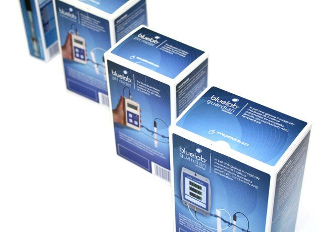
- Bluelab is a Tauranga company currently making waves internationally with their innovative brand of hydroponic measuring equipment. As a key client we firstly developed an international advertising campaign that communicates why their products are unique and captures their audience in an engaging and fun manner. It has successfully grown awareness globally and continues to create impact with their overseas market. We continue to help grow the Bluelab brand with the redesign of their complete packaging range, product photography, marketing literature, product brochures, overseas retail solutions, merchandising kit, and tradeshow materials.
|
 - 1 2 3 4 5 6 7
- Turnwood
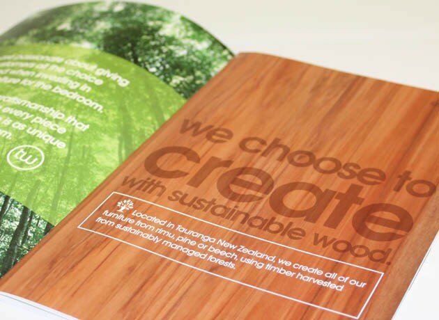
- This local thriving furniture business sells their quality bedroom furniture through key retailers nationwide. From art directing their latest furniture shoot, launching three new suites into the market, refreshing their brand identity and corporate communications, to a comprehensive product brochure and bespoke in-store display stands along with point of sale material. Turnwood has achieved a lot in the past 12 months and we continue to grow their brand awareness and deliver strategic initiatives to drive sales.
|
 - 1 2 3
- Tasman Aluminium
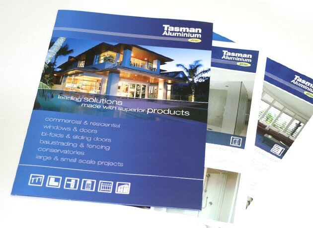
- Tasman is one of the largest aluminium joinery companies in Tauranga. They have been producing and delivering aluminium joinery solutions for commerical and residential environments since 1976. We helped them to define the visual direction for their brand and corporate communications, redesigned their sales and marketing material, products brochures and signage.
|
 - 1 2 3 4
- Wakerley Motorhomes
- Wakerley Motorhomes decided it was time for a brand refresh to reflect their status as New Zealands top motorhome manufacturer. We developed a badge-like device to reinforce their premium brand and the quality of their products. A positioning line of far from ordinary was the key driver for their unique brand story and a play on words for being on the road and how their motorhomes are far from ordinary. We translated this concept into an effective advertising campaign that set them apart from their key competitor, engaged their target market, significantly increased brand awareness and overall sales for the business. Most recently we have created a new service division identity and marketing material along with the redesign of their website.
|
 - 1 2 3
- G3 Financial
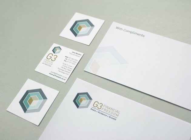
- G3 is a financial planning and advisory company located in central Tauranga. Our brief was to create an identity that had a strong visual connection to their brand name and unique business offering. Our branding solution gave a professional, clean and modern look and feel to their communication. We then translated this across stationery, signage and a flagship brochure with a unique format to stand out within their sector.
|
 - 1 2 3 4
- Kiwiana Christmas
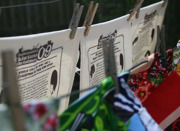
- To thank our clients for their support in 2009 and show our appreciation we took on the challenge of sewing each person their own designer floppy hat made from the iconic Kiwi tea towel no two are the same! The idea is to remind ourselves and celebrate all the things that make our Christmas as Kiwi's unique.
|
